Charts and graphs are visual representations intended to interpret sets of data in a visual manner. These representations are commonly used for determining a change in businesses’ different aspects like sales or production. You can usually find this when showing trends, relationships between data, or patterns. Meanwhile, there are several types of graphs and charts you can utilize depending on the set of data you will interpret. Learn its types, ways to make charts in Excel, and discover another effective method to create these representations.
Excel Quick and Simple Charts Tutorial
- Chart and Graph Types
- How to Make a Chart in Excel
- How to Make a Chart Online
- 3 Chart Making Principles
Chart and Graph Types
Charts and graphs come in various types that will allow you to clearly show readers the relationship between a set of data and patterns visually. Below are some of the common types of graphs and charts used. Learn about their characteristics and when to use them.
Types of Graph
- Line Graph
Line graph depicts changing data in a continuous manner. You should see two axes namely the x-axis and y-axis wherein each axis represents data. One of which shows the value and the other displays the timeline. You can create graph in Excel easily when comparing variables or showing trends which is the use of line graphs.
- Bar Graph
Bar graph is another popular type of graph that focuses on comparing values in numeric form. Likewise, it consists of two axes representing the categories and value of each data. There is a rectangular bar with height and length that is directly proportional to its value. This graph is often used to show data comparison among categories. Additionally, you can select between horizontal and vertical bars and create graph in Excel.
- Pictograph
As the title suggests, this type of graph represents data based on pictorial information instead of lines or bars. It shows comparison through the use of repetition of the same icon or symbol. Say you want to graph the number of VIP customers in a certain restaurant every day of the week, numbers of VIP customers may differ every day. Pictograph could be of great help in cases like this.
Types of Charts
- Pie Chart
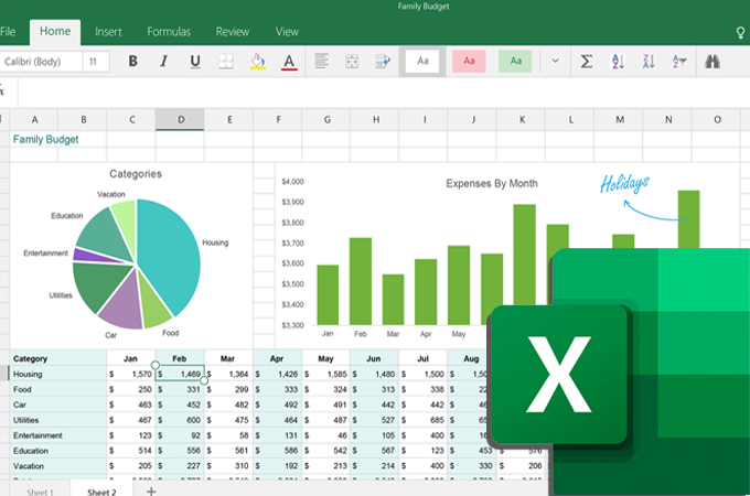
You can also make a chart in Excel when trying to show the composition of something. The chart for this purpose is Pie chart. The pie comes into parts where each pie slice represents a value of a particular category and their sizes vary depending on how much they represent. This works best for displaying population segments or budget allocations for businesses.
- Gantt Chart
If you want to show project schedules in an easy-to-understand illustration, Gantt chart has a special place. It lists the activities or tasks along with the timeframe for the project. Each task has a bar length that is proportional to the start and end of the activity. You can make a chart in Excel of this type and create a schedule for project tasks.
- Flowchart
As far as the process is concerned, a flowchart is a suitable chart for this kind of need. Most of the time, it is used for illustrating complicated processes to show decisions, steps, actions from start to end. Moreover, it comes with special shapes or symbols for each part of the process. On some occasions, there are legends that explain the meaning of each shape or symbol in addition to the actual flowchart.
How to Make a Chart in Excel
Learning how to make Excel charts and graphs is quite easy. Microsoft Excel can help you organize gathered data and it provides convenient ways to create visual representations. To show you how this is done, below is a simple step-by-step instruction to guide you.
- Launch the Excel app and open a new Excel document. In order to insert chart in Excel, you need to provide all the data to be used and input them in a worksheet.
- Once data input is complete, select the data cells in a worksheet which should be included in the graph or chart you want to make. Then, click the “Insert” tab and select your desired type of chart.
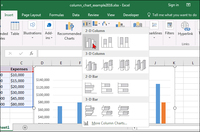
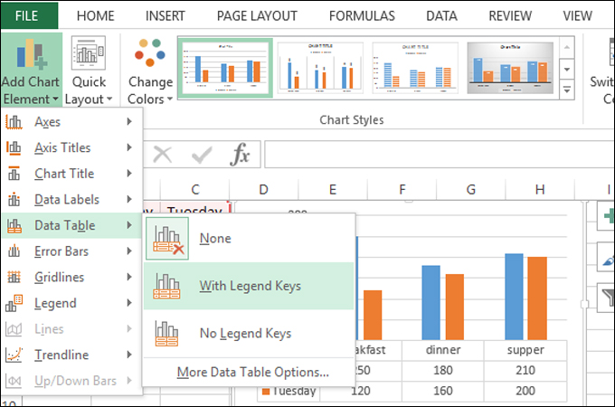
- After selecting a chart type, you should be able to create a chart in Excel in no time. You can further enhance the chart by going to the “Chart Design” tab where you can modify the Axes, Axis Title, Legend, and a lot more.
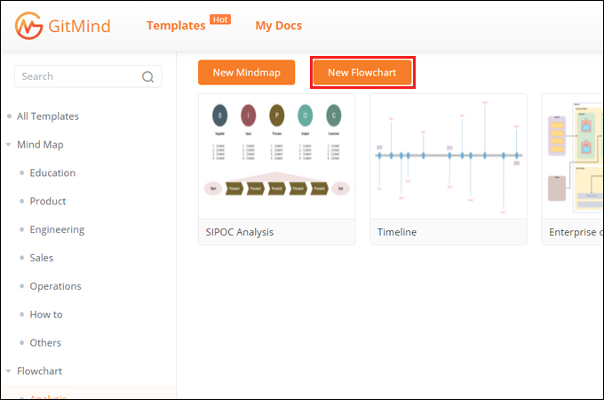
How to Make a Chart in GitMind
Apart from the above solution to make a chart in Excel, there is another convenient and effective method to create charts and graphs. GitMind is an amazing visual tool that allows you to generate various types of diagrams. This tool provides shapes dedicated to a specific diagram and for general usage. If you want to know how to create Excel chart or graphs but want to try something better, this tool is a great alternative. Find out how to use this amazing tool by following the steps below.
- Search for GitMind on the web then hit the “Get Started” button to use the web-based tool. Download the tool to operate on your computer.
- Next, click on the “New Flowchart” button and you will be directed to its editing interface. Alternatively, you can look for an illustration that fits your needs from the template gallery.
- Get shapes you need from the left menu, resize them and arrange accordingly. Once done, click the “Insert” option and choose “Text” to put labels on the chart.
- You can now customize the look of the chart. Select a shape or text to modify and then look adjust its properties from the right-side menu. You can also change the arrangement according to your needs. Finally, you can export the chart as an image or PDF file.
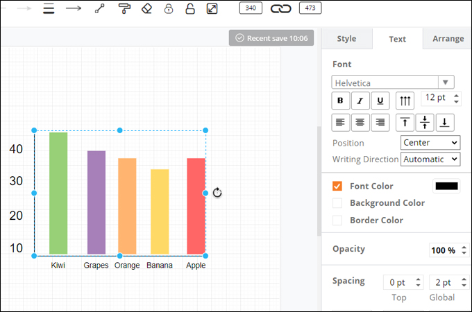
Chart Making Principles
3 Chart Making Principles
You know now how to make a chart in Excel. But one more important thing to learn is how to construct in a way that is understandable for everybody. This includes the font or text to use, placement of elements and so much more. That said, we listed some pointers that may help you present charts and graphs well.
- Neat and clean graph– a clean and neat graph means you are not using too many colors, as well as shocking colors that draw away the attention of your viewers. You should also consider using readable text. Summarize a long text into short while retaining the meaning of the information.
- Appropriate theme– of course, one of the crucial parts is to choose the right theme for the topic. Never also neglect your audience when choosing the theme or style for your charts. In other words, choose the theme you think appropriate for the audience, topic, and purpose.
- Elements placement– some creators fall short of this mistake when trying to create graph in excel. Always look for standard positioning of the elements of your chart including titles, symbols, and added graphical elements. They must be able to convey the message and enhance your presentation rather than confusing your audience.
Conclusion
In summary, charts and graphs allow you to interpret and present information in a brain-friendly manner. The good thing is you can easily create a chart in Excel or using other programs that will make things convenient.
Leave a Comment