
Organizing numbers into meaningful diagrams is a great way to make logical conclusions about complicated problems. For example, suppose you run a bicycle store and want to stock your inventory based on the age of the people in your vicinity. You can go first through the municipal/city registry and record the ages of all possible consumers. after that, you can start making a histogram. Meanwhile, by gathering and analyzing data related to what you have, you may actually understand almost everything about what type of bicycle you need to stock. Continue reading to truly understand what a histogram is.
Histogram Introduction and Tutorial
- Histogram Definition
- Parts of a Histogram
- Editable Histogram Examples to Download
- Benefits of using Histogram Graph
Histogram Definition
A histogram is a popular charting tool. It is used to express categorical data as well as information on intervals and ratios. This was also used to show the important parts of a particular dataset in an easy-to-understand way. It is also handy when working with large data sets, such as those with more than 100 observations. Meanwhile, if you really want to use this strategy, you may utilize the histogram example given in this article to increase the identification of your results or flaws in the data you’ve gathered.
Parts of a Histogram
Title
The histogram definition provides information about the data displayed on the map title. It includes the data shown on the graph display. A caption on a histogram chart allows a service provider to quickly understand whatever the chart is really about.
Axes
A histogram chart contains two axes, which are usually labeled with what they signify, giving the title of the histogram graph more significance.
Bars
In the histogram example shown above, the bars constitute the primary visual description of the data collection. The horizontal bars of a graph represent the multitude of times data occur inside each specified range.
Scale
A histogram’s scale is a collection of numbers used to evaluate or characterize the information on the chart. This contributes to the width and length of each rectangle bar on the distribution graphic.
Legend
A legend is a tool that may be used to interpret a histogram graph. It is most typically used in histograms with more than one element. It generally describes the technique used to collect the data.
Editable Histogram Examples to Download
GitMind can let you simply generate illustrations, control charts, and other types of visualizations. You may also use this tool to easily develop diagrams, flowcharts, and including histogram graph. It is a web-based platform that aids users in mind mapping and comprehending processes via the use of flowcharts and diagrams. Your work will automatically be saved across all of your devices, including your phone and laptop.
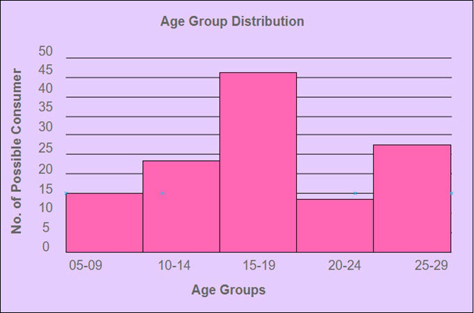
The histogram graph above shows that the majority of persons in your neighborhood are between the ages of 15 and 19. You can simply decide and explain your stock need thanks to the presentation of numerical data.
Benefits of using Histogram Graph
Histograms are primarily used to illustrate and arrange a huge number of measurements or numerical data in an easy-to-understand format. Also, based on the histogram definition, it makes it simple to identify where the bulk of values on a measuring scale lie, as well as how much variation exists among those values. The following are the objectives for generating a histogram:
- Determining if the results of multiple processes vary.
- Graphically summarizing big data sets.
- Aessing if a procedure change happened through one time frame to the next
- Taking the outcomes and comparing them to established specified boundaries or goals.
- Presenting the level of expectations.
- For rational decision and result prediction.
Conclusion
Over all else, the histogram is the simplest method to comprehend data. As you’ve seen with the graph shown above, you may use GitMind’s features to create single or several charts. The histogram helps in visualizing the various forms of the information. Finally, you’ve seen how the histogram may be used to analyze data sets, with endpoints serving as class labels. The histogram supports shifting periods to give a more accurate representation of the data and performs well with numerical data.
Leave a Comment