
Pie charts are one of the easiest charts to make. They are just basically circles with divisions and labels. However, did you know that you can also make this chart using Microsoft Excel? This spreadsheet application can not only make tables and sheets, but also create various charts. This knowledge is what we’ll share here, as we will teach you how to make a Pie Chart in Excel using its native options.
Create a Pie Chart in Excel
- How to Make Pie Charts with Percentage
- How to Make a Pie Chart in Excel With Multiple Columns
- How to Make a Pie Chart in Excel with Multiple Data
How to Make Pie Charts with Percentage
One of the most common form of Pie Chart that we see is the one with percentage values in it. Although technically, each slices of the chart represents a certain percentage, it’s important to show it in numerical value. This is done to help readers who are not accustomed to reading this chart know what information you’re trying to relay. On that note, if you are trying to learn how to create a Pie Chart in Excel with percentage labels then follow the steps below.
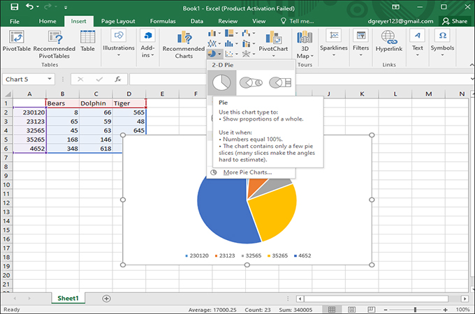
- Start-off by adding the information about the chart to the cells in the spreadsheet. Then, press “CTRL+A” to select all cells with information and then click the “Insert” tab and select the “Pie Chart” icon and choose the 2D pie chart.
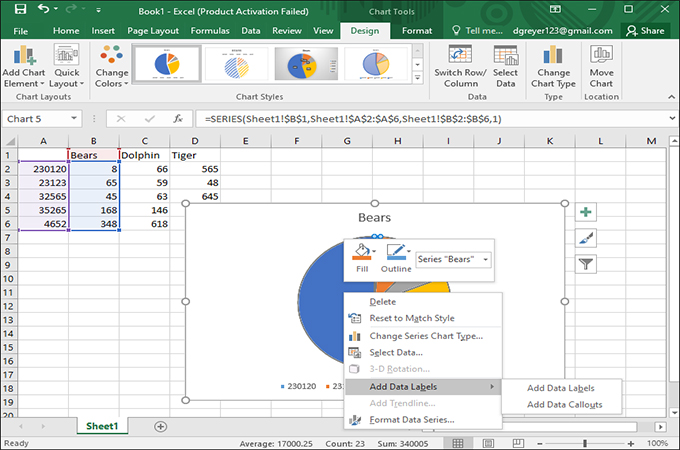
- Once the pie chart appears on the spreadsheet, you can now right-click on it. From the menu, select “Add Data Labels” and then right-click on it again and this time click “Format Data Labels.”
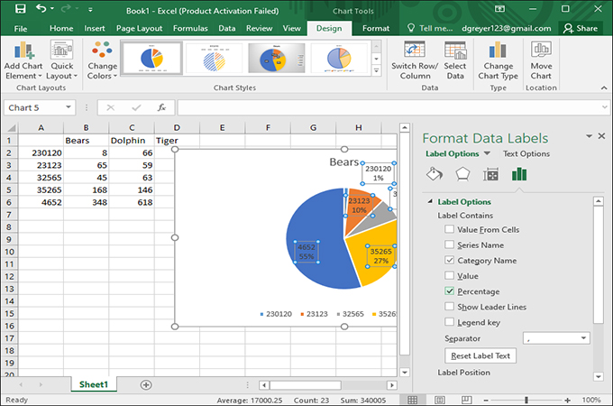
- Tick the “Category Name” option as well as the “Percentage” option. The data will then convert to percentage and you can save the chart. Now, that is how to insert Pie Chart in Excel with percentage using the basic options.
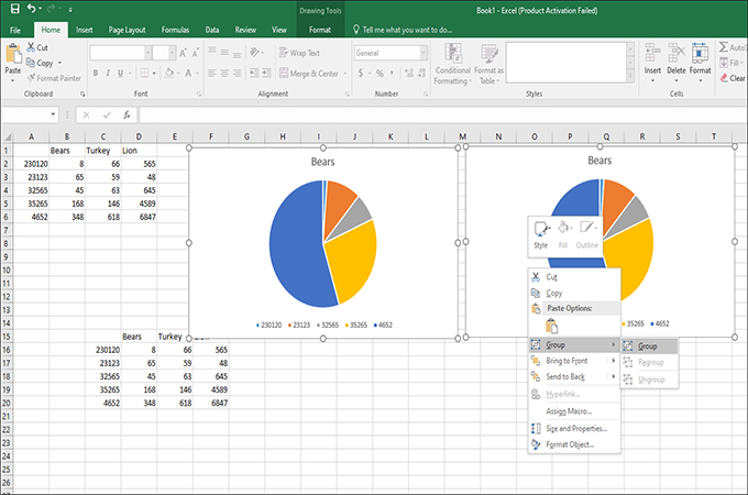
How to Make a Pie Chart in Excel With Multiple Columns
It can be quite troublesome if a single Pie chart is not enough to handle all data. That is why we often create more than one to capture all data sets especially during presentation. It is indeed hard to present one Pie chart at a time when you have at least three in store. On that note, having a chart with multiple column will provide a lot of convenience for users and readers as well. This will save a lot of space and time because all the necessary chart will appear in a single page. With that being said, here are the steps on how to make a Pie Chart in Excel with multiple columns.
- First, add all the data in the table. Then, press both “CTRL+A” keys together to select all cells with data. After that, add the pie chart by clicking the “Pie” icon and select the 2D pie chart. Repeat this process until you get more than 1 pie chart.
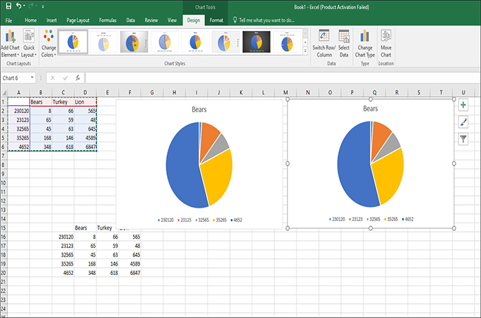
- After that, select all pie charts and then click the “Format” button. From there, select the “Group” option. After that, select another “Group” button to consolidate the pie charts.
How to Make a Pie Chart in Excel with Multiple Data
Lastly, we will provide you with ways on how to create a Pie Chart in Excel with multiple sets of data. As we all know, data is important in any chart and that is a given. The importance of a chart depends on the data itself since the whole point of the chart is to present the data. Most of the times, there are multiples sets of data present which is needs an entire chart to visualize them. If you want to learn how to make one using Excel, then follow the steps below.
- Add all the data in the spreadsheet and then select them all by pressing “CTRL+A.”
- After that, hit the “Pie” icon and then select the “Doughnut” option. This will place all the multiple data that doesn’t normally fit in a regular Pie Chart.
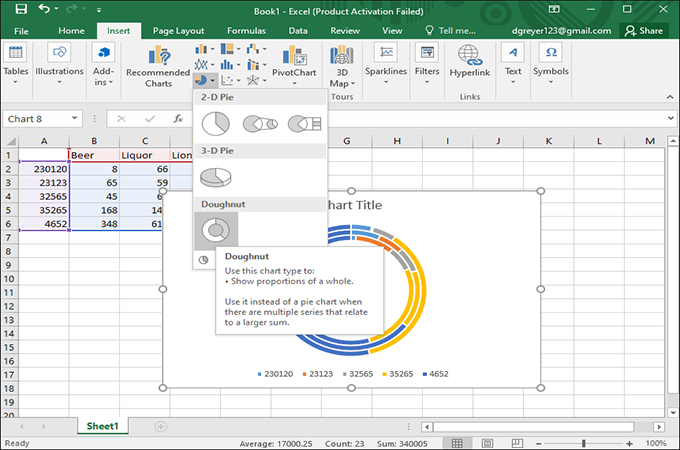
- Save the chart by clicking the “File” tab and then select “Save.”
Conclusion
Aside from the usual computing capabilities, using Excel to perform other tasks is rather simple. This is due to the automated features that it provide to users, where you can add different charts instantly. Same can be said with learning how to insert pie chart in Excel since they are available all the time. Just follow the steps above, and you’ll be making your own Pie chart without any issues.
Leave a Comment