
As its name implies, a pie chart is a type of graph that uses slices in representing data in a circular graph. As a matter of fact, it can summarize large data in a visual form. Furthermore, this type of graph is simpler and easy to understand compared with other graphs. On that note, we will further discuss what and how to make a pie chart with ease below.
Definition of Pie Chart
A pie chart is a circular graph that is divided into slices to show the relative size of data. By using this graph, users can easily show a comparison of sales of the company, profit, marketing, etc. Besides, it can be an effective communication tool for the audience since they can immediately understand the information rapidly.
Another thing that you need to remember is that a pie chart is commonly known as a pie diagram which is divided into sectors for representing data clearly. Each sector or slice illustrates the numerical proportion of the whole part. That being said, it is best to use it compared with line and bar graphs in terms of comparison.
Why We Use Pie Chart?
If you are not yet convinced that make a pie chart is the best and easy way to present your data, here are some points that you need to consider why we use a pie chart.
- Easy to understand. Unike the other graphs, pie chart can easily understand since it is very organize and the large data can be summarized in a circular chart which divided into segments.
- Easily to show information at once. Using pie chart can make comparisons very easy. All the data needed is presented in the chart.
- It doesn’t require a lot of explanation. Unlike other graphs and charts, they include complicated informations that are difficult to understand. That might leave a confusion to the audience.
How to Create Pie Chart Online?
Now, we will show you how to create pie chart online using GitMind. This is a web-based tool for mind mapping and brainstorming which can be used to create diagrams and charts. In addition to that, it comes with cool and stylish templates which can be edited depending on your liking. Also, you can start from scratch if you don’t want to use the templates provided. What’s more, this tool enables you to save files on your cloud storage and access them across all your devices. To have further got an idea on how you can make a pie chart conveniently, below are the easy-to-follow steps.
- On your computer, visit the official page of the tool using the your favorite browser. From here, hit the “Try it online” button and you will be directed to the editable templates.
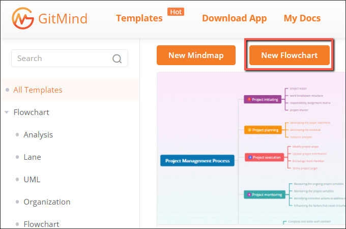
- Next, click the “New Flowchart’ button to start from scratch.
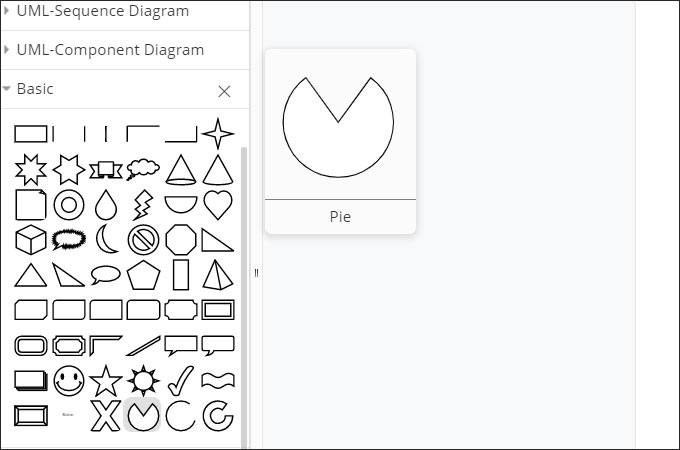
- From the shapes section, click the drop-down on the “Basic” folder then choose the pie shape. Adjust the size of the pie as needed.
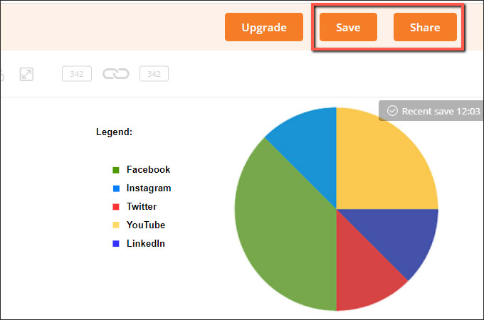
- Add text to the slices and create a legend then customize the color, font style and size. Once all set, export the file.
Conclusion
As shown above, a pie chart is one of the best visual forms that can represent and summarize large data. Furthermore, it is very easy to understand since it is simpler compared with other graphs. In fact, creating a pie chart doesn’t require any expert tool. By just having a computer, internet, and a browser with you then you’re good to go.
Leave a Comment