
Sankey diagram is an important visualization tool that may be used in material flow analysis and life cycle assessment. It may be used to illustrate material, energy, and waste flows as they enter a given economy. Technically, this type of figure is a synthetic depiction of a more data-intensive endeavor. Meanwhile, if you’re curious about what this is all about or want to try out certain templates, you may keep reading below or check out any of the templates supplied in this post.
Introduction to Sankey Diagram
What is Sankey Diagram
Sankey diagrams could be used to illustrate the exchange of power, cash, expenses, or anything else that has a flow concept. A Sankey chart is a type of representation that depicts the movement of data from one set to another. The entities that are linked are referred to as nodes, and the interactions are referred to as links. Sankey diagrams are ideal for displaying a many-to-many mapping between two zones or various pathways through a series of stages.
It has also custom colors that may be assigned to nodes and connections in the Sankey graph. Different color schemes can be assigned to nodes and links using their color choices. They can represent the movement of information from one entity to another. The entity out of which data transfers is made reference to as a node; the node from which the flow term originated is the origin node, and the access point from which the flow terminates is the aim base station.
Sankey Diagram Example by GitMind
GitMind could assist you in producing a competent Sankey diagram. To create diagrams, you do not need to be a professional or an illustrator. It’s an online diagram and flowchart creator that’s great for thinking and process mapping. The tool promotes communication and collaboration, which is beneficial to teams and companies since it allows employees to work constantly and remotely. Furthermore, you may try out some of the templates offered by such a tool by clicking the “Edit this Example” button, or you could just start from scratch and study its various functions on its official site.
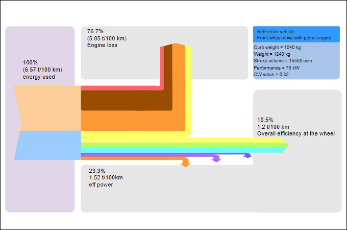
Energy Consumption in a Passenger Vehicle
The energy equation for a passenger automobile is depicted in this Sankey chart. A considerable portion of the energy utilized for movement just at wheel is wasted, particularly as heat is lost. We can also identify the extra passengers in the automobile. The data are presented as percentages as well as exact numbers. All arrows in the graphic are color-coded and, by necessity, proportionate in size to the flowing volumes they indicate.
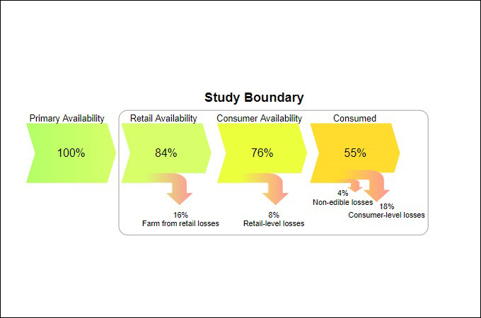
Food Distribution Network
We can identify losses along a food processing chain in this relatively basic Sankey graph. Losses are depicted as an arrow spreading out to the bottom and labeled with percentages at each stage. So, despite the fact that the graphic is based on available data, we just have proportions here. This is referred to it as the effectiveness of food production, preparation, and consumption.
Importance of using Sankey Chart
The importance of having a Sankey chart is that they are more ideal for illustrating the energy balance or resource flows than a traditional bar or pie chart, or even a flow diagram. Sankey charts highlight the biggest and most influential entries in a system. It may also depict complicated, multidimensional processes such as money allocation in a clear, easy-to-understand visual style. This approach is quite useful for displaying the movement of resources among elements. Furthermore, data discrepancies, including such measuring and communication mistakes, may be recognized via visualization.
Conclusion
Overall, the Sankey diagram is indeed a type of flow chart used to visualize materials, expenditure, or energy fluxes. It can also depict power or volume movements with vectors proportional to flow quantity, as well as flows in a system, manufacturing technology, or supply chain. It is also supported by varied color flow amounts with varying dimensions that are readily grasped. Finally, Sankey diagrams can successfully communicate all facts and messages, whether to various parties like within your development team. As a result, we advocate using a diagramming application like GitMind to create your design.
Leave a Comment